Your products are awesome, and your ecommerce site is getting traffic. But are you happy with how well your product pages are converting? No matter what your product page conversion rate is, it could always be better. Try one of these ten tips below for an extra boost.
(Of course, I’m assuming you already have awesome photography and product descriptions on your product pages. Make sure those are stellar, then add some of these into the mix.)
1. Transparent shipping
When customers are shopping around for products, they want to know how much the total cost will be — especially since shipping prices can vary wildly between ecommerce sites. That can lead to an epidemic of abandoned carts as customers add products simply to view shipping costs.
To prevent this — and make the sale — make your shipping costs as transparent as possible on product pages. If you can offer free or flat rate shipping within the continental United States, use it as a selling point. If your shipping costs are variable, try adding a shipping rate calculator.
2. FAQ section
Do you get the same questions regularly about your products? For every person who emails you for more information before purchasing, plenty simply move on to find a similar product elsewhere. Help undecided buyers make a decision by including frequently asked questions on product pages. As a bonus point, this is also a great way to boost your keyword score on that page.
3. Live chat
There’s a reason so many companies are including those obnoxious live chat bubbles on the side of the screen: they’re effective. Live chat has the highest customer satisfaction rate of any customer service channel, according to Zendesk.
That’s partly because they’re so easy to use, and partly because they offer a human touch that you can’t get through other non-phone channels like social media or email. Plus, offering live chat on your product pages is a great way to start engaging customers who may never call or email.
4. Action shots
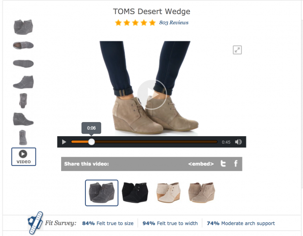
One of the hardest parts about buying things online is trying to visualize exactly how they will look or work in the real world. Help your customers get the picture by providing action photographs or explainer videos.
The videos don’t have to be high-tech or flashy. Take Zappos for example. A 15-second shot of a model’s feet gives you an idea of what it would be like to walk in the shoes, while another 15 seconds of narration point out relevant details.

(PS, did you know TOMS made wedges??? OK, back to writing this blog post.)
5. Customer generated reviews
We’ve talked about user generated content campaigns before. They’re a great way to get more content and social proof on your site overall — but especially when it comes to selling products.
Shoppers are 63% more likely to purchase a product that has reviews. It not only can help answer any questions they have about the product, it also decreases their risk. If hundreds of people are telling me TOMS wedges are comfortable to walk in, I’m much more likely to click the buy button without trying them on first.
(Spoiler: I clicked the buy button.)
6. Cross-sells
Promoting cross-sells are a time-honored way to increase the average order value in your store. But they also can help your product pages convert on its own. That’s because they can provide shoppers with some comparison to other items you sell, and help them imagine how they could use it in conjunction.
Try talking about other product options in your product descriptions, or use an image carousel to display related products.
7. Wish lists
Not all shoppers are ready to purchase in the moment. Wish lists give them the option to favorite an item and come back to your site when they’re ready. They also function as a tool to let shoppers compare a few items if they’re trying to make a decision.
Finally, they give you the opportunity to remarket to shoppers by sending automated emails to see if they’re still interested and alert them to sales or low stock, or to use retargeting ads to remind them of their favorited items while they’re browsing other sites.
Learn more: 5 Ways to Create a Personalized Shopping Experience
8. Scarcity
One way to push consumers to make a decision is by indicating scarcity or hyping up the uniqueness of your product. Obviously, you shouldn’t lie about the number of items you have left, but if stock is running low you can create a sense of urgency by letting people know that on your product pages.
Likewise, highlight things like items being limited-edition, brand-new, or otherwise unique in order to create a sense of excitement in the browser.
9. Social Proof
Along with reviews, you should provide other social proof to demonstrate that people like your products. This is another great spot for user generated content, like photos from Instagram or curated tweets praising your product.
This is especially helpful if your product can have a range of applications, or if it’s something like a garment that comes in a range of sizes. Showing other people using the product in real life is a better way to convince your average shopper than showing it on a single model.
Learn more: How to Create a Customer Loyalty Program that Gets Results
10. Strong CTA
Tell your customers what to do: Buy It Now!
No beating around the bush here — your calls to action (CTAs) should be strong, brightly-colored, and noticeable. This is a good opportunity to do some A/B testing of colors and copy to see what converts best.
What have you done to help your ecommerce product pages convert more? We’d love to hear from you! Let us know in the comments.


One response to “10 Tips for Product Pages that Convert”
thanks for giving me tips about the product page may good bless you